Here are some screen shots of where I'm at with my book spreads for my type speech. I'm doing Nelson Mandela's speech when he accepted his presidency, and I just added some photos to the spreads to see if they would work well with the typography.
All of the pictures relate to the speech or the time period in some way. The one on "we pledge ourselves" is from the day Mandela made this speech, I believe. I also used pictures of the people of South Africa protesting to set Mandela free, or or protests and conflict that was happening at the time that Mandela was fighting against.
Monday, March 24, 2014
Friday, March 14, 2014
motion inspiration
SAUL BASS --
After watching North By Northwest, Psycho and Ocean's Eleven's title intros designed by Saul Bass, it really caused me to think about how music can effect the viewer's mood while watching the video as well as how that music can inspire how the words move. While all three of these title intros that Saul Bass designed had different moods and feelings, he used these moods and feelings to direct his designs. For example in Ocean's Eleven, which had a happier, up-beat song playing. He used circles within the type as well as had the words and imagery flash in and on in a more playful way.
MARLENE MCCARTY --
In the intro designed for American Psycho, the music really drove how and when the objects moved. Red dots fell from the sky to the tone of when the music beat hit. What was even more creatively impressive, though, is the viewers take on what is happening from beginning to end. At the beginning the music is softer and slower, and the red dots look like blood. But as the movie progresses and the music gets quicker you see that it is food being prepared, and the viewers take on it is totally different. But the creepy, eerie feeling is still there giving a sense for the movie.
In I Shot Andy Warhol, I really enjoyed how she zoomed in on the red letters giving the screen an overwhelming bleeding of the red, which gave the viewer a new perspective as well as an interesting new view.
In Safe, I really enjoyed how the title of the movie went along with the video that was being played: how the words looked like the lights of the car were blinking on the title. That little moment ties the words in with the film, and this continues in the other words that are shown across the screen. I think this ties in the feeling of the movie so well for the viewer.
I think she does a good job of fitting the mood with the film through the use of type. Whether this be the words moving faster or slower, or moments where the type is tied in with the video.
My chosen video for inspiration is one by Danny Yount.
You can watch the video HERE.
This video appeals to me because of the perspective that Danny uses throughout the whole video. The video used is seen from different angles, and doubled and the type reflects this idea of illegibility. Danny really uses the music and video to decide how the type is going to appear, when its going to appear, and what its going to look like. I think the different speeds that the type appears keeps the video interesting for the viewer. I also appreciate how he uses the lines from the video to guide the viewer's eye through the whole piece. These lines are then reflected through the text seen, which is something else I appreciate.
Overall I really love the feel of the sequence that he's providing. The music isn't overwhelming, but its a nice addition and the video work along with the type draws me in and makes me want to see more.
Sunday, March 2, 2014
expressive typography
After reading "Watching Words Move", a book by Ivan Chermayeff and Tom Geismar that displays the meaning of words like "adding" "stolen" and "half" and moving the letters around, stacking them, cutting them, adding symbols, subtracting letters... whatever they need to do to show tell the reader the meaning of the word.
I loved reading this, and so many of the ways they portrayed the words were so clever. One of my favorites was "automobiles":
Then we were asked to find at least three examples of expressive type on our own, and here are my findings.
 DESIGNER: MATT WILLEY, the co founder and senior editor of Port Magazine.
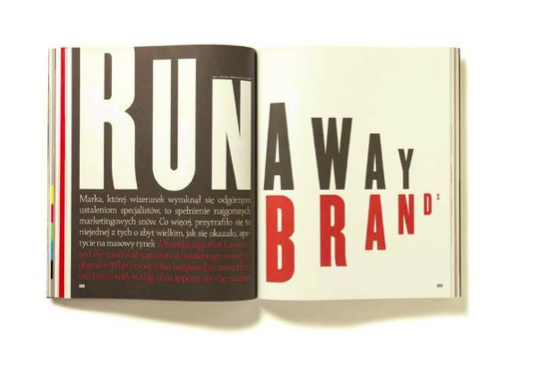
This spread he designed, however, was for Futu Magazine. He is using scale and color to portray "Runaway Brands" in an interesting way. It looks like the letters are running away to the right of the page. He does this by making the letters dramatically bigger and smaller. He also uses color in a smart way. "RUN" really pops off of the page with the white on black, giving the beginning of the word a little kick off that portrays motion as well.
DESIGNER: JASON MANN
This poster was designed for a band named "Liars". Jason Mann cut up the letters to form a picture of the knife with the "I" seen in the word. He also used spacing and rotation to draw the eye to that part of the word, as well as using a different color for the knife to put emphasis on it, and still keep it a little hidden.
DESIGNER: "GORDORCA"
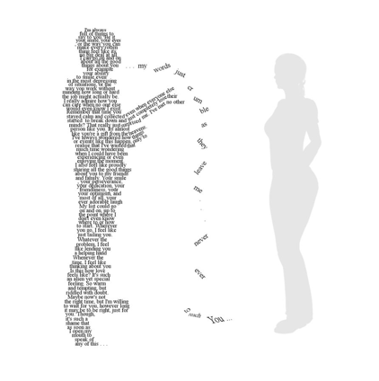
I love this example I found by Gordorca called "I speak alone". I love the way the designer pulled out this one sentence of the text that seems to define the whole block, and use it to portray the meaning. The techniques the designer used are spacing and rotation. The words appear to be falling to the ground, rather than traveling to the other person which is exactly what the text says. I also like the way the designer pulled a part some of the words and broken them/changed the size to represent them "crumbling" to the ground like it says in the text.
I loved reading this, and so many of the ways they portrayed the words were so clever. One of my favorites was "automobiles":
Then we were asked to find at least three examples of expressive type on our own, and here are my findings.
 DESIGNER: MATT WILLEY, the co founder and senior editor of Port Magazine.
This spread he designed, however, was for Futu Magazine. He is using scale and color to portray "Runaway Brands" in an interesting way. It looks like the letters are running away to the right of the page. He does this by making the letters dramatically bigger and smaller. He also uses color in a smart way. "RUN" really pops off of the page with the white on black, giving the beginning of the word a little kick off that portrays motion as well.
DESIGNER: JASON MANN
This poster was designed for a band named "Liars". Jason Mann cut up the letters to form a picture of the knife with the "I" seen in the word. He also used spacing and rotation to draw the eye to that part of the word, as well as using a different color for the knife to put emphasis on it, and still keep it a little hidden.
DESIGNER: "GORDORCA"
I love this example I found by Gordorca called "I speak alone". I love the way the designer pulled out this one sentence of the text that seems to define the whole block, and use it to portray the meaning. The techniques the designer used are spacing and rotation. The words appear to be falling to the ground, rather than traveling to the other person which is exactly what the text says. I also like the way the designer pulled a part some of the words and broken them/changed the size to represent them "crumbling" to the ground like it says in the text.
Subscribe to:
Posts (Atom)


