Friday, January 31, 2014

incomplete manifesto for growth

For our type journal this week we read the Incomplete Manifesto for Growth by Bruce Mau, which I absolutely loved. It's one of those simple, but inspiring articles that I want to read every week. Or when I'm feeling frustrated and uncreative. 

Bruce Mau is a designer, author, institute founder, and more. He is the founder of Bruce Mau Design, wrote many things such as this manifesto and The Third Teacher. He founded Institute without Boundaries which is a post-grad design program inspired by his conviction that the future is calling for a new breed of designers. These are just a few of many of things that Bruce Mau has done.

In Incomplete Manifesto for Growth, the whole list includes many inspiring mantras, but my chosen one from the week is this:
"Don't be cool.
Cool is conservative fear dressed in black. Free yourself from limits of this sort."

This one popped out from the list to me because I thought the beginning was so clever: Cool is conservative fear dressed in black. I laughed to myself and loved it all at the same time because it's so true. "Cool" just means that a lot of people like it, which probably means its a little mundane and a little expected. This isn't true for all "cool" things, but I think its important to remember great design doesn't come from wanting to make something "cool". Which goes along with the second part of his advice, "free yourself from limits of this sort". Trying to make something that's "cool" is limiting yourself as a designer.  If you try to make something that a lot of people will like you might end up not making something to your full potential. Where is the creativity in making something popular among the masses? Probably not there most of the time. But these are just my thoughts after reading that quote. This week I'm going to not be cool.

---------------------------------------------------------------

For our type project my mood board style is "bold free spirit" and I wanted to share some of the images and creativity that has been inspiring me for the project so far.


|| HAPPY FRIDAY, TO YOU. ||

Sunday, January 26, 2014

type journal: jessica hische & louise fili

For this week's journal in typography class we were assigned to watch this video of Jessica Hische. Jessica is an illustrator, designer, hand-letterer, and creator of beautiful artwork. In the interview she went through a timeline of how she became the designer she is today (or up unto that point in the video) because she had stumbled into a niche profession of being a hand lettering designer. 
I have always loved and appreciated hand lettering, so it was interesting to hear about it from someone who knows whats up.

She talked in the video about how lettering and type are two very different things. Letting are word that exist for a specif location/application. Type, on the other hand, are designed to be type-able fonts or design of the whole alphabet. I thought this was a good take-away/thing to remember as a designer.

She also talked about how as a designer you have to have the patience of making new things every time. You can't just pull things from past work and think they'll fit into new projects. She was referencing how she makes new type and lettering for new projects, because it wouldn't be it's best/perfect if she didn't do so.

Near the beginning of the video, she talked about her time working for Louise Fili. She told about different lettering project she had done, and then that work has really impacted her free lance work. I noticed how she is continuing to learn and build off of everything she's done. That's an important thing to remember as  designer - that you're always evolving. She talked about how she really have to find her niche in illustration and design and learn to do that really well. 

Another interesting project she talked about was her Daily Drop Cap project. This was one of her side projects, but it made her well known as a designer. She decided when she stopped working for Louise Fili and went free lance full time she wanted to be sure to be working on lettering projects at all time, so she decided to make one drop cap a day until she made twelve fonts. It was exciting hearing her talk about this project and other projects she did on her own or for "fun" because you could tell they were things she was passionate about. It was these projects that kept her loving design when maybe she didn't have other fun projects that were paying the bills. It's inspiring to hear about those kind of projects as a designer. 

After watching the video I went through her website and pulled some of her work that I really loved for inspiration.


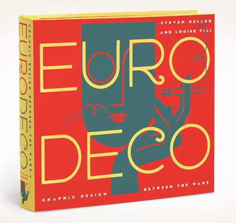
I also pulled some work from Louise Fili's website that I loved. I noticed when looking through her work what a wide range of styles she incorporates into her work. Even the hand lettering in each project has it's own twist. That is something I really appreciate about her work.