


I was so proud of my book! But I'm also so ready for summer. A little break from school but still with some crafting, creativity, fashion, etc... so stay tuned. :)

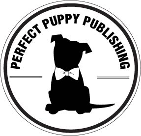 |
| I had a lot of fun working on the logo for our publishing company. This is what I came up with. |
 |
| This photo shows my re-design of my Bradbury Thompson spreads, which turned out much more successful the second time. In this version the blue on the bottom page is still really dark, however, and some of the fonts were hard to read. |
 |
| This picture shows my rough drafts of the table of contents, title pages, and again my Bradbury Thompson spreads. The top three layouts are the title pages and the middle three show the table of contents. I was really happy with these rough drafts, and I loved a lot of aspects on many of them. My group really liked what I was doing with the far right pair and so I decided to take some of their critiques and move forward with that basic idea. |
 |
| One of the first things I noticed in this huge store was that if the book didn't have an interesting or eye-catching spine design it was easy to miss. I dually noted this for my own book design. |
 |
| I loved the tabs and right and left alignment used in the table of contents of the book "P.S. I Made This" |
 |
| Simple, but it caught my eye from afar. Which I loved. |
 |
| I liked the use of a black and white picture with a touch of color in the title graphic. |
 |
| The overlay of orange reminded me of some of Thompson's designs. |
 |
| There's something just beautiful about a really old book. The gold letterpress was so pretty. |
 |
| The overlap of opaque text, pictures, and blues reminded me of Thompson's work. I liked how they used these principles. |
 |
| Ironic that this book is titled "Even More Great Designs" because I hate the design of this cover. It's terrible. |
 |
| The simple gold letter press, again, caught my eye from afar. Love it. |
 |
| This book caught my eye from the get go and I just had to get a picture before I left. Not only did the mix of drawing/pictures intrigue me but I loved the fact that this modern book was stacked on old books. It might have been unintentional, but it was an interesting contrast. |