Tuesday, April 8, 2014

Expressive Typography final project

Below is my final Expressive Typography project. The project included two parts: a printed book along with a motion video. Overall, I learned a lot about typography and what the choice of type, position of type, etc. can say to a reader and how this can communicate my message as a designer.
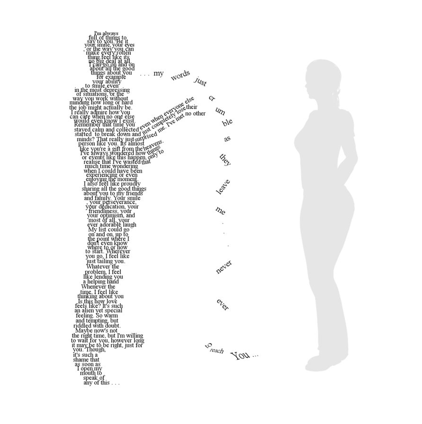
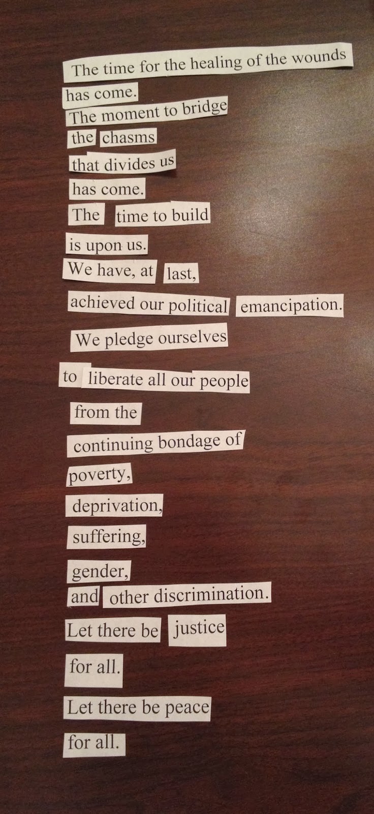
The speech I chose to work with was an excerpt from Nelson Mandela's Inaugural Address. 
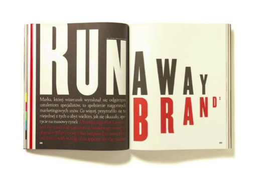
 At the beginning of the book part of the project, I really tried to find meaning in all of the words and portray this through the type. Some of the ideas were cheesy and some of the ideas were effective. Through this exploration, I have narrowed down my final ideas into the spreads you see in my final type book. During this process I had to learn a balance of effective expressive type, and how to balance this with clean type. I originally chose to work with the color blue because it was the color that stood for freedom on South Africa's flag, and this directly correlates with Mandela's speech. The color reads well to the viewer as freedom, and overall gives the book an inviting tone. The pop of yellow works well with the blue for contrast with the blue to really display the type choices I'm making when I use the yellow. I also decided to include pictures from Nelson Mandela when he was giving this speech, as well as photos from when people were protesting him being in jail, and relevant photos from South Africa that documented the ideas Mandela is talking about in the speech. I think these photos throughout the book help tell the story to the reader along with the type, without distracting from the words. After designing the book, I started designing the motion video.


At first when designing the video, I decided to design it separate from the book in the fact that I didn't want the video to look like my spreads in motion. I made all the type expressive on its own (while using most of the same principles from my book) and then added the photos and colors after, to give that connection to the book. I was very intimidated by after effects at first, because I had never used it before, but now feel very accomplished and am excited to keep expanding upon my knowledge of after effects. With the video I was able to portray some of my expressive type ideas from the book even better when given the opportunity for motion. Like the word "wounds" that cuts as he says it. Its the same cut in the book, but is so much stronger to the reader when they see that motion happening as he is saying it. I think matching music with the speech is also a big part of the video being effective, and I like how the music I found builds as he is talking and has an inspiring feel to it, as he is talking about how freedom has come for his people. Because I was able to design actual motion with the video, I thought more about how these words could become more powerful for the viewer in the video. Overall, I learned a completely new design program as well as how timing, sound, movement, and type can effect a viewers learning and seeing experience. I really enjoyed this project and feel like I learned a lot about typography and what it can say to the world.


Monday, March 24, 2014

type book rough draft

Here are some screen shots of where I'm at with my book spreads for my type speech. I'm doing Nelson Mandela's speech when he accepted his presidency, and I just added some photos to the spreads to see if they would work well with the typography.


All of the pictures relate to the speech or the time period in some way. The one on "we pledge ourselves" is from the day Mandela made this speech, I believe. I also used pictures of the people of South Africa protesting to set Mandela free, or or protests and conflict that was happening at the time that Mandela was fighting against.

Friday, March 14, 2014

motion inspiration

SAUL BASS --
After watching North By Northwest, Psycho and Ocean's Eleven's title intros designed by Saul Bass, it really caused me to think about how music can effect the viewer's mood while watching the video as well as how that music can inspire how the words move. While all three of these title intros that Saul Bass designed had different moods and feelings, he used these moods and feelings to direct his designs. For example in Ocean's Eleven, which had a happier, up-beat song playing. He used circles within the type as well as had the words and imagery flash in and on in a more playful way.

MARLENE MCCARTY --
In the intro designed for American Psycho, the music really drove how and when the objects moved. Red dots fell from the sky to the tone of when the music beat hit. What was even more creatively impressive, though, is the viewers take on what is happening from beginning to end. At the beginning the music is softer and slower, and the red dots look like blood. But as the movie progresses and the music gets quicker you see that it is food being prepared, and the viewers take on it is totally different. But the creepy, eerie feeling is still there giving a sense for the movie.
In I Shot Andy Warhol, I really enjoyed how she zoomed in on the red letters giving the screen an overwhelming bleeding of the red, which gave the viewer a new perspective as well as an interesting new view.
In Safe, I really enjoyed how the title of the movie went along with the video that was being played: how the words looked like the lights of the car were blinking on the title. That little moment ties the words in with the film, and this continues in the other words that are shown across the screen. I think this ties in the feeling of the movie so well for the viewer.
I think she does a good job of fitting the mood with the film through the use of type. Whether this be the words moving faster or slower, or moments where the type is tied in with the video.

My chosen video for inspiration is one by Danny Yount.
You can watch the video HERE.

This video appeals to me because of the perspective that Danny uses throughout the whole video. The video used is seen from different angles, and doubled and the type reflects this idea of illegibility. Danny really uses the music and video to decide how the type is going to appear, when its going to appear, and what its going to look like. I think the different speeds that the type appears keeps the video interesting for the viewer. I also appreciate how he uses the lines from the video to guide the viewer's eye through the whole piece. These lines are then reflected through the text seen, which is something else I appreciate.

Overall I really love the feel of the sequence that he's providing. The music isn't overwhelming, but its a nice addition and the video work along with the type draws me in and makes me want to see more.

Sunday, March 2, 2014

expressive typography

After reading "Watching Words Move", a book by Ivan Chermayeff and Tom Geismar that displays the meaning of words like "adding" "stolen" and "half" and moving the letters around, stacking them, cutting them, adding symbols, subtracting letters... whatever they need to do to show tell the reader the meaning of the word.

I loved reading this, and so many of the ways they portrayed the words were so clever. One of my favorites was "automobiles":
Then we were asked to find at least three examples of expressive type on our own, and here are my findings.

DESIGNER: MATT WILLEY, the co founder and senior editor of Port Magazine.
This spread he designed, however, was for Futu Magazine. He is using scale and color to portray "Runaway Brands" in an interesting way. It looks like the letters are running away to the right of the page. He does this by making the letters dramatically bigger and smaller. He also uses color in a smart way. "RUN" really pops off of the page with the white on black, giving the beginning of the word a little kick off that portrays motion as well.


DESIGNER: JASON MANN
This poster was designed for a band named "Liars". Jason Mann cut up the letters to form a picture of the knife with the "I" seen in the word. He also used spacing and rotation to draw the eye to that part of the word, as well as using a different color for the knife to put emphasis on it, and still keep it a little hidden.


DESIGNER: "GORDORCA"
I love this example I found by Gordorca called "I speak alone". I love the way the designer pulled out this one sentence of the text that seems to define the whole block, and use it to portray the meaning. The techniques the designer used are spacing and rotation. The words appear to be falling to the ground, rather than traveling to the other person which is exactly what the text says. I also like the way the designer pulled a part some of the words and broken them/changed the size to represent them "crumbling" to the ground like it says in the text.


Friday, February 28, 2014

+ today in hand lettering

JUST WANTED TO SHARE A LITTLE BIT OF MY HAND LETTERING ENDEAVORS TODAY


++ HAPPY FRIDAY ++

Thursday, February 27, 2014

Speech Typography

For typography class we are making a motion graphic type video to a famous speech, either from a given list or one of our choosing. After spending hours listening to speeches on the list as well as various speeches that I looked up, I was getting really frustrated with not finding anything that was jumping out at me. Finally a friend suggested I look a speeches by Nelson Mandela, and I found one that I liked. So if it gets approved, I am going to do a clip from Nelson Mandela's speech after he was elected as president.


I am planning on using the clip up until 42 seconds, and then editing in the part where he says "Let there be justice for all. Let there be peace for all." I wish I could do the whole part of this clip, but the full thing is 1:30 and that would just be too much.

 Here is the part I'll be using:
"The time for the healing of the wounds has come. The moment to bridge the chasms that divides us has come. The time to build is upon us. We have, at last, achieved our political emancipation. We pledge ourselves to liberate all our people from the continuing bondage of poverty, deprivation, suffering, gender, and other discrimination....Let there be justice for all. Let there be peace for all."

Some Q & A about my chosen speech:
_ Who is speaking? Nelson Mandela

_ Why was/is the speech important to society? He was the first non-white to be elected as president of South Africa. His efforts during his lifetime and more specifically during his presidency helped end racial segregation and ushered in a peaceful transition into majority rule.

_ Why do you feel it is important or interesting? I feel this is important because Mandela made a huge impact on South African history as well as a huge impact worldwide.

_ What is the emotion, mood, tone, personality, feeling of the speech? The tone of the speech is serious, yet successful. He speaks in a serious tone but the words he speaks are freeing.

_ What is intonation, emphasis, what is loud, stressed, or soft. Where are there pauses? There are parts that he pauses before/after he says "has come" and he emphasizes these words. He emphasizes the words poverty, deprivation, suffering, gender, and discrimination. He speaks clearly and uses pauses between spoken lines and is sure to emphasize little two word combos like, "for all" and "has come".

_ What do you FEEL should be loud or soft, long pause or rushed? I feel these little bits that he emphasizes through surrounding them with pauses or fluctuating his voice a little bit should be emphasized. Ex: "has come" "at last" "for all"... it is these phrases that shows the purpose of the speech. That South Africa has been fighting for equality, and these phrases show that it has come.

_ Is there a call to action? When listening to it what are key/emphasized words? The last snippet that I want to include in my speech feels kind of like a call to action. It's where Mandela says, "Let there be justice for all. Let there be peace for all." It's like he's telling what is to come - but also reminding the listeners this is what they need to fight and live for because it's what they deserve. 

_ How does it make you feel? It makes me feel proud of Mandela and peaceful - I would say happy but that isn't the word to describe it. This is a man who has been discriminated his whole life because of the color of his skin - and he has been fighting for his country for equality ... and now it is coming. It's happy in the way that you know injustice has taken place but now that will change and THAT makes you feel happy. It makes your heart smile.

_ How do imagine that the audience felt? I would imagine the audience felt excited and happy and free. I need to do more research on the election and how the people of South Africa felt during this time -- but I imagine they would be happy. 

_ Could there be another interpretation of the speech? Like I said I need to do research, but I assume there were people who didn't want him to become president like there all in all elections. Perhaps the white people who were used to being the "best" in society were not excited for equality, but this is something I need to research more.

ABOUT NELSON MANDELLA:
Nelson Mandela was born on July 18, 1918, in Mveso, Transkei, South Africa. Becoming actively involved in the anti-apartheid movement in his 20s, Mandela joined the African National Congress in 1942. For 20 years, he directed a campaign of peaceful, nonviolent defiance against the South African government and its racist policies. In 1993, Mandela and South African President F.W. de Klerk were jointly awarded the Nobel Peace Prize for their efforts to dismantle the country's apartheid system. In 1994, Mandela was inaugurated as South Africa's first black president. In 2009, Mandela's birthday (July 18) was declared "Mandela Day" to promote global peace and celebrate the South African leader's legacy. Mandela died at his home in Johannesburg on December 5, 2013, at age 95.

(I found this information from: http://www.biography.com/people/nelson-mandela-9397017)

Here's the excerpt I'm using from his speech:

"THE TIME FOR THE HEALING OF THE WOUNDS, HAS COME. THE MOMENT TO BRIDGE THE CHASMS THAT DIVIDES US HAS COME. THE TIME TO BUILD IS UPON US. WE HAVE, AT LAST, ACHIEVED OUR POLITICAL EMANCIPATION. WE PLEDGE OURSELVES TO LIBERATE ALL OUR PEOPLE FROM THE CONTINUING BONDAGE OF POVERTY, DEPRIVATION, SUFFERING, GENDER, AND OTHER DISCRIMINATION ...... LET THERE BE JUSTICE FOR ALL. LET THERE BE PEACE FOR ALL."

Studying my speech:
the following picture shows the different emphasis/pauses during my clip. The words underlined are emphasized, the words boxed are emphasized around pauses and the stars show where the dramatic pauses occur.


Planning the flow:
The next part I cut up my speech and decided how it would flow best, and which words would work best on a spread based on the emphasis/pauses of the speech. Each line shown is a separate spread. 


packaging design

In one of my studios we started our new project this week, packaging design. To determine what object we'd be working with we drew small cheap "everyday" items from a bag, and I chose a kids harmonica toy.

 At first I was a little discouraged because it is VERY cheaply made and the sticker is poorly designed, but then I realized I get to design packaging for a kids toy - which is so fun. And I get to make the design better - so I shouldn't be discouraged by the current poor design!

So I started some research. And I found all of this hilariously wonderful videos of little kids playing harmonica: (click the pictures to link to the video)

http://www.youtube.com/watch?v=26c8B6rgSTY

http://www.youtube.com/watch?v=oEDBkmmVKM0
This one makes me SO happy, you can't help but smile when watching this video!

So for part of our research we were suppose to decide how this product makes the customer feel. And after watching those videos of kids playing the harmonica, I had so much to work with. Check out my list:
I FEEL--
happy
like I wanna dance
like I wanna laugh
like smiling
like making NOISE
like being a star
attention getting 

And then I started researching packaging. More specifically toy packaging. Check out some of the inspiring pictures and packages I found --


I like the idea of my package having a more retro-toy vibe. I want the package to be attention grabbing to kids and their parents (who would be buying the toy) but kids' toys these days are almost TOO attention grabbing. They have bright colors and illustrations exploding everywhere - so a challenge for myself will be designing a package that is just as much appealing but not as much overwhelming. I think these retro inspirations are good examples of being simple while also bright and endearing.

PRIMARY AUDIENCE --
I decided my primary audience for this toy had to be kids. The item was clearly designed for kids, and there wasn't really anyway around it. On my products original package, it says ages 4+, so I'm pretty much going to stick with that. My specific person from my target audience, however, is a seven year old girl in first grade, my sister :)

That's a picture of her dressed up in my clothes, so no worries she doesn't really drink Starbucks. But here is a little bit about her/my target audience:

Lauren is a seven-year-old girl who loves dressing up, running around, being outside, being loud, and tearing apart things in her older sister's room. Lauren has always enjoyed singing, dancing, and performing in front of her family or anyone who will watch. You can find her singing in the kitchen, in the bathtub, and pretty much anywhere she goes. She love being creative through drawing and making songs, so her mom bought her a toy harmonica to channel her creative energy into. Lauren absolutely loves her new harmonica and she takes it with her everywhere she goes. Shes loud and she's proud of every sound she makes, and she only annoys her family with the music (noise) most of the time. Lauren loves making music and beats, and this harmonica has caused her to start telling everyone she wants to be a musician when she grows up.