Tuesday, September 24, 2013

type projects.

Yesterday we turned in our first project for type class [ Visc 202 ] and I wanted to share my final layouts as well as the link to my behance which displays the final project.

This first project explored the design of 8" x 8" layouts using a grid to display the information of the Sunset & Sunrises for Lawrence on various dates. The body type we were required to use was given to us, and we were challenged on different phases of the project with different restrictions. All of the phases, starting with cut and paste and then moving to the computer, had to display the type in a visually pleasing way while also striving to use hierarchy in the design to easily flow the reader through the information. Below you can see my final seven layouts (2 from phase 1, 2 from phase 2, and 3 from phase 3). For the final turn-in we mounted these seven layouts on 12" x 12" presentation boards along with our process notebook of all of our process bound together.


 You can check out this project on my Behance site here. I will continually update my projects from this year on that site, so feel free to keep checking back at what else I'm working on.

MUSICAL INFLUENCES:
During this project I was, and still am, obsessed with the new record "The Walking In Between" by Ben Rector. While it didn't directly influence any of my designs for this project, I listened to it over and over and over again while working on most of these layouts. Check it out.

Tuesday, September 17, 2013

dreaming of summer

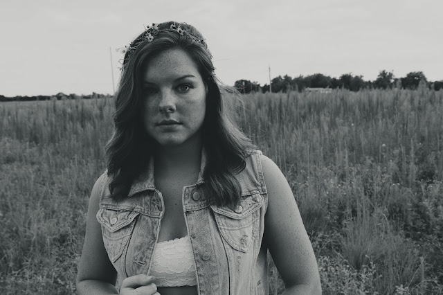
My friend Sidney and I took my new camera out this summer for a little photo shoot just for fun.
We channeled our inner Free People and took to the fields of Wichita. Below are the results.


Wednesday, September 11, 2013

Adrian Frutiger


Adrian Frutiger is a Swiss typeface designer who is most famous for designing the typefaces Univers and Frutiger. This is especially relevant to my Typography, as we are using Univers for our spreads. Amongst designing many fonts over his career he also was commissioned by Swiss watchmaker Ventura to design watch faces for a limited edition line. Some awards he has won over his design career: Medal of the Type Directors Club of New York | 1987, Typography Award from The Society of Typographic Aficionados (SOTA) | 2006, European Design Hall of Fame | 2009.

Here is an example of one of his most known typefaces, Univers:


Univers was designed by Frutiger in 1954 and is an example of a san-serif font (sans = without; meaning it doesn't have "little feet" on the letters). This typeface is also arranged by the Univers Grid, in which the numbers on the grid are used to define the width and position of each variation of the typeface. This grid is pictured below. A system like this for a typeface to be designed around was a very innovative process at the time.

Tuesday, September 3, 2013

today in typography.

TYPOGRAPHY

VIDEO REFLECTIONS


video 1
Wim Crouwel's says he is very jealous of young designers because of all the possibilities "graphic design" means these days. He said on the other hand he isn't jealous because you have to find your way amongst all of the possibilities.
My favorite quote from the video he said was:
"Keep your radar turning and pick up everything you love".
I think in this short video he made two very great points. We have lots of possibility, but we have to seek what we love and know we are to find it. As a designer young designer this was inspiring to always seek what I am passionate about, and if I work hard there will be a possibility to pursue it.

video 2
The profile video on Wim Crouwel was very interesting to see how he relates with and produces design. For his designs, he is very focused on functionality. Many of his posters were designed with a detailed grid and one he even showed this grid. You could see how each piece fit perfectly into the grid. At times he tilted the grid, but followed it. He was really ahead of his time by always following the grid and this idea carried into the digital movements in design. This video was beneficial for me to see how successful and what beautiful designs he made by following the grid. While at times it was frustrating making our first typography assignment on just one grid over and over again, as designers we can't ignore the basics of design.