Tuesday, January 29, 2013

Back to School

We've been back at school for a couple weeks now and I figured it was about time I post an update on our current BDS 102 (basic design studies) studio project.

First project of the semester: a photo collage documenting time & space.
Restrictions: 4" x 6" photo prints (matte finish) must be used to create a photo collage mounted on a board as the final product. a minimum of 35 photos must be used.
Objective: to build and understanding and show photography's unique relationship with time & space by showing and perhaps altering both.

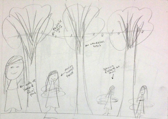
Our first step was thinking out idea possibilities and I also used the brainstorming period as a time for some rough sketches. After discussing possible subject and scene ideas in class, we were asked to bring in three different rough draft collages today to class. Below you can see my rough draft collages from class today paired with my very ROUGH and quick sketches from initial brainstorming.


The idea behind it: this simple task of making your morning cup of coffee is given life through photography with multiple scenes and movement of the girl.
The idea behind it: the life of a busy college student becomes portrayed through the collage by showing all the activities a student might partake in during one sitting.
The idea behind it: this idea was altered from the sketch to the collage. The idea behind the photo collage became a traveler whom is always moving during all seasons, and two other seasons would be portrayed through clothing choice in the final collage.
After discussing my collages with my teacher and classmates I have decided to expand upon my second idea of the busy college student for more practice collages.

Along with this assignment we have had many in-class videos and well as readings. Rather than share the load of them with you, I decided to pick the notes from my favorite video we've seen so far to share.  The video is actually one we watched in class today and can be seen by clicking this link. Errol Morris, a photographer, discusses what we've lost in photography and here were some of my key notes:
1. We've lost the idea that a photograph is a part of the world.
2. Sometimes a photo can be posed because of the absence of something. (ex. when you choose what you're including in a photograph what you've cropped outside the frame is gone therefore the scene is edited).
3. Morris discussed the lack of asking questions when seeing photographs such as what they are, what they are about, and what is going on in the scene. He explained this by saying, "aren't you curious of what you're looking at?"

Thursday, January 24, 2013

Coffee & Design. The two best things.

Over winter break I had the privilege of designing a logo for KU Navigators, a student ministry on campus. I was told to be creative but also was given examples of past Navigators logos. It was a really fun project to keep me busy over break and I love the end results. Not to mention, I got a free coffee mug out of the deal! You can see the final product below.


I used the mug today for the first time while working on some homework!
It was exciting to see my design on a real product.


Classes have started and I feel just as busy as I was during the end of the semester last fall! So expect some exciting design and studio updates in the future because our first project for BDS 102 is well underway.

// Hope your thursday is wonderful!

Friday, January 18, 2013

Party like the Brits

My friends and I were a few of the many who stayed up till four in the morning or however late it was to watch the royal wedding a few years ago. So of course when my good friend Abbie mentioned having a baby shower for Will & Kate over break, I jumped on the idea. I mean who wouldn't want an excuse to talk in a british accent and wear a fun hat? So Abbie and I co-hosted a baby shower for Will and Kate. And for two college girls who don't have kids or have ever planned a baby shower I think we did a great job. It was a smashing affair.

I designed the invitations for the party

Abbie and I (the hosts) thought a photobooth would be a hit at the party. We designed a british backdrop (the flag decor, pillow, and framed pictures of Will & Kate) as well as designed british baby shower props to make the photobooth a little more fun.


Instead of asking guests to bring a gift, we asked everyone to bring a snack to share.


The photobooth was a hit! And the props made it extra fun.
Game #1: Guess that celebrity baby. (The photo on screen is Kate Middleton!)
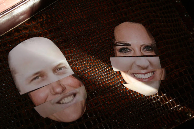
Game #2: we provided cut out features of Will & Kate so our guests could piece together what the royal baby will look like. The winners of the "cutest baby" won photos of Will & Kate.
The party was so much fun! I didn't hate getting to talk in a British accent for at least two hours. And now I have some great british decor for my room... so it was a win-win situation.

Sunday, January 13, 2013

Just smashing.

I recently finished my first ever Smash Book. The best way I can describe smash books is that they are a mix between a journal and a scrapbook. Check out the company's site here. You can purchase one online, at Michael's, or at Target. I absolutely love "smashing" and I would suggest it for anyone, even the non-crafty because the book itself makes it artsy on its own with the decorative pages and eclectic accessories you can buy. The theme of my smash book was my freshman year of college, but some people do trips, summers, etc. Enjoy some of my favorite layouts from mine, and I hope it inspires you for some design of your own.

//Tip: Mod Podge a statement picture or magazine clipping to the front to define a theme. My choice: the first (and my favorite) KU Jayhawk to represent my first year at KU.

//Tip: Hot glue stickers, buttons, paper cut outs to the top of paper clips to make fun page dividers. (See my owl one top right of this page).
//Tip: the best part of a smash book is the personal touches. Save your ticket stubs, parking permits, name tags, notes, etc. because looking back they will make your memories that much more special.
//Tip: I started using envelopes as my hand-made smash pockets.
//Tip: save old magazines to create cutout details. On this page, I used the magazine clippings to make a title on the top left page.
//Tip: mini clothespins and string come in handy, especially when artistically displaying lots of notes.
//Tip: not every layout has to be overcrowded. a lot of times less is more.
//Tip: buy a set of stamps with all of the letters of the alphabet to create personalized titles for each page. Also: make pictures into pockets! (bottom right page)
I had an amazing first year of college and I'm so happy I took the time to display it all in this book. I'm sure I'll be looking back and laughing at all the fun memories years to come. Start your own smash book.. you won't regret it!

Hello, 2013.

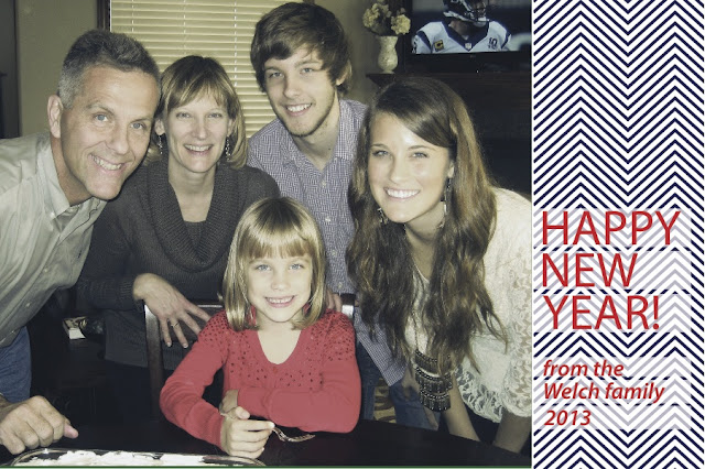
This year my family was a little late on sending out Christmas cards so my mom suggested she might be sending out Happy New Year cards. I designed our Christmas card last year, so I decided to keep up the tradition and design this year's card as well.


I wanted to keep it simple and I had just recently learned how to make chevron print in illustrator so I thought it was a perfect match. The funny thing is, my mom has yet to print them or send them so I doubt any of our friends will ever see them. But, it was fun to design so I think it's worth it.

// New Years Resolutions
While I didn't set any new years resolutions for myself, ShopRuche.com has been posting fun resolution ideas on their Facebook page and these are a few of my favorite ideas:
1. Send handwritten letters
2. Learn how to cook three course meals (or just find more recipes... summer project perhaps?)
3. Compliment someone everyday
4. Document your year in a scrapbook (I would highly recommend Smash books)
I thought some of those were fun ideas and if you want to see more "like" Shop Ruche on Facebook for updates throughout January.

Hope your 2013 has been absolutely stellar so far.

Friday, January 11, 2013

kansas at sunset.

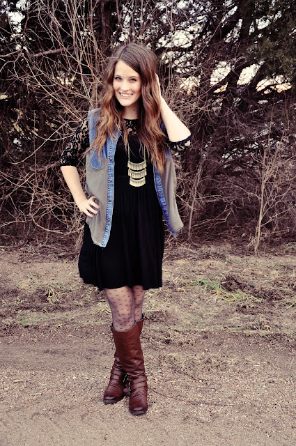
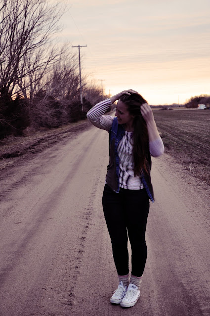
My friend Kaitlyn and I hopped a fence and brought along a camera for a mini photo-shoot to show off the vest I made this past week. She agreed to let me style her to be apart of the shoot as well, so the vest is shown in a dressed up as well as a more casual look. I'm still experimenting with photography and photoshop but I loved the Kansas-at-sunset setting we stumbled upon.

// vest: made by me
// dress: francesca's
// necklace: charming charlie's
// tights: gap
// boots: steve madden 


// top: j. crew
// jeans: gap
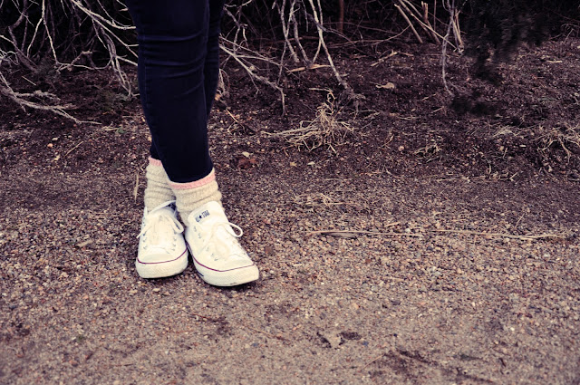
// socks: eddie bauer
// shoes: converse


kaitlyn styled the shoes and socks herself and
I love the look so much. i have cool friends.


If you want to see more details on how I made the vest check out my previous post here.

Wednesday, January 9, 2013

An Experimental DIY

Pinterest always brings along some pretty great crafting ideas and so of course when I saw this shirt pinned I challenged myself to replicate it:

// inspiration from Pinterest
I loved the top immediately and the flowy bottom reminded me of a shirt I own that I don't wear very often, so after purchasing a denim vest for less than $5 from Goodwill I had all the materials I needed to make one myself. I did a poor job of documenting the process through pictures, because I basically just guessed the steps along the way and hoped it would all turn out, which it ended up turning out great! Each cut I made I was worried something would go horribly wrong, but it turned out better than expected.

I used extra denim from the vest to cut out the pockets and recycled studs from a belt I had to attach to the upper seam of each pocket. While the above picture doesn't have exact step-by-step directions if you have sewn tops or dresses before I'm sure if yours would turn out just as well as I did if you give it a try.

// Happy Wednesday!