In type class we've been working on designing magazine layout spreads, and were encouraged to watch the following videos to help with our project.
First we watched this TED talk by David Carson. This video was interesting because I had heard about David Carson broke all these rules in magazine and graphic design by basically doing whatever he wanted with the pictures, text, etc. rather than following the "rules". His magazine Ray Gun broke all of the rules, such as making the text legible in some layouts, and it was funny hearing him talk about the work. In one example he was showing, he couldn't even read what it was suppose to say. But the design spoke to him and said something about what he thought the text should say, so isn't he still successfully displaying the type? I think so. Unless I was the writer, in which I would probably be upset. He presented a new way of seeing and designing information.
The second video we watched was this Vimeo displaying the first issue of Katachi Heroine.
This magazine includes some REALLY cool animation that pulls the reader in and so many interactive ways to get through the information in the magazine. It was inspiring to figure out how to do all these cool things with my iPad layout, so I'm hoping I can figure some of those things out.

Sunday, December 8, 2013
Sunday, November 17, 2013
layout design
In type class last week, we spent a day looking through magazines for inspiration / ideas / examples of what we could do with our layout spreads. The following examples are spreads that I wanted to document for help in my own design process. Whether it be with how the designer dealt with the type, or the placement of the photos each of the following layouts I thought worked in some way.


Tuesday, November 12, 2013
typography
For typography we were asking to explore and blog the answers to the following questions:
_ What are the advantages of a multiple column grid.?
A: Multicolumn grids provide flexible formats for publications that have a complex hierarchy or that integrate text and illustrations. The more columns you create on your grid, the the more flexible your grid becomes.
_ How many characters is optimal for a line length? words per line?
A: A line should be approx 12 to 14 inches long. When working with a 9 pt to 12 pt font, a maximum of ten to twelve words or sixty to seventy characters per line would be acceptable.
_ Why is the baseline grid used in design?
A: Baseline grids serve to anchor all (or nearly all) layout elements to a common rhythm.
_ What are reasons to set type justified? ragged (unjustified)?
A: Justifying your text makes a clean shape on the page as well as uses space efficiently. Flush left and jagged right goes along with the organic flow of language and avoids awkward spacing that justifying sometimes creates.
_ What is a typographic river?
A: a typographic river is the space between words in paragraphs that form and connect between lines to form a river-looking space throughout the paragraph. This is distracting and awkward to the reader and should be fixed.
_ What does clothesline, hangline or flow line mean?
This is the imaginary line created on a page where the designer decides to "hang" the text from on that page.
_ What is type color/texture mean?
A: Type color is effected by the space in between the lines of text. Smaller lines = bolder type color. Thicker lines = less type color. Texture is created in typography by mixing bold typefaces with thin small ones; creating contrast with your use of type.
_ How does x-height effect type color?
A: Typefaces with larger x-heights need more interline spacing than those with smaller x-heights. Therefore, typefaces with smaller x-heights have denser color than those with larger x-heights.
_ What are some ways to indicate a new paragraph. Are there any rules?
A: Some ways to indicate a new paragraph are: indents, a space between lines, along with many different ways designers get creative with coming up with ways. The only rule I could find was to not indent the first line of the first paragraph, as it is the beginning and no separation mark is needed.
A key image:

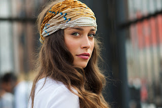
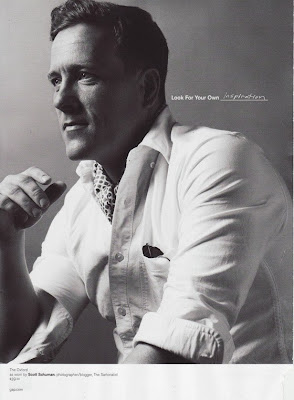
I'm still trying to nail down exactly what I want to use for my key image for my typography project, but I want to do one similar to the picture above. I know it want it to be an image that captures how he photographs fashion as well as captures emotion through the photo.
Sunday, November 10, 2013
Scott Schuman continued
In order to prepare for a presentation in class of our photographer, we were told to research and prepare the following.
SCOTT SCHUMAN // 1500 word essay
Sources 1 & 2 from above are great video interviews by Intel and A Big Think Interview. Also, check out Scott Schuman on TED here.


We were also asked to create a word list about our photographer / their work / feelings you get when looking at their work / etc. I doodled mine in my sketch book and scanned it in:

SCOTT SCHUMAN // 1500 word essay
Scott Schuman is a world-renowned fashion photographer and
blogger who created and runs his own fashion blog called “The Sartorialist”. This
site has become one of the fashion industries most respected and visited sites.
Time ranked The Sartorialist as one
of the Top 100 Design Influences in 2007. But Schuman’s blog hasn’t been his
only career success. Schuman has been asked to contribute to Saks Fifth Avenue,
French Vogue and GAP, just to name a
few collaborations throughout his career. While he started out as a boy from
Indiana, he has certainly become a man that has taken the fashion world by
storm.
Growing up Schuman says he was the average Midwest boy who
played and was interested in sports. It wasn’t until he started seeing all of the
things some of his favorite athletes were spending their money on like cars and
fashion that he realized he instinctively gravitated toward fashion. After
researching fashion more and dressing himself better he noticed he got more
attention from the ladies, so he didn’t hate that aspect of the fashion world
either. He began to see the world through pictures and see fashion of the world
through pictures that he studied in fashion magazines. As a boy from Indiana,
he said that looking at Vogue was like looking at a whole knew world he never
knew existed.
After graduating from Indiana University Schuman moved to
New York City where he landed marketing jobs for top designers like Jean-Paul
Gaultier, Rudolph Valentino and Helmut Lang. He even served as the director of
men’s fashion at Bergdorf Goodman. Around that same time he opened his own
showroom specializing in sales and press for up-and-coming designers, which
taught him the competitive aspects of the fashion industry. With his own
showroom he basically assembled designer’s reputations from the ground up
giving him a designers eye that would help him later on in his career. While he
loved fashion, he also had an interest in photography. “I didn’t want to become
a ‘fashion photographer,’” he says, “but I knew somehow that my loves of
fashion and photography would eventually merge. I just never guessed it would
be in the form of a blog.”
Schuman was in the fashion world for fifteen years doing
fashion sales and marketing before he started his blog. Schuman’s now
successful fashion journalism blog started out with the idea to “travel the
world searching for people whos style define who we are today.” He wanted to
mix photos of guys and girls who were stylish and who were fashionable, which
he says are two different things, and put them online. At the time he only knew
of websites, but thought that would take too many people to be able to create
it. So after stumbling upon an interior design blog online and realize he could
use that format for his photographs, The Sartorialist was born. The blog was
created in 2005, a time when he didn’t know of any other street style blogs
that were already happening. He saw the blog as a great way to share his work
visually, while limiting text, which is something, blogs at that time weren’t
doing. Schuman chose to create a photo driven blog, which he knew could make
him successful all over the world. “One of the things that I knew about doing a
photo driven blog was that you didn’t have to read English to enjoy the
photographs.” And he was right because his readers are from all over and range
from old to young and rich to poor. That’s one of the things he is most proud
of, the diversity of his readers. The instant success of his blog allowed him
to make it his full time job just a few months after the blog hit the internet.
He said he loves the idea of street fashion because you get
to see how people actually wear the styles and trends. “There’s an element of
new, there’s an element of previous season there’s your own history, your
sweatshirt from high school, vintage pieces. Its that combination that I find
so much more interesting than the runway.” The idea that the runway show is
much abstract and more of the direction the designers want fashion and trends
to go, while what people actually wear is much more enticing to Schuman. Schuman
believes there is a different between fashion and style, and that’s something
he documents through his photos. “The difference between fashion and style is
that fashion is the sometimes, its the thing that’s happening at that
moment…while style is something that’s always there in your personal wardrobe.”
He says not everyone has fashion and style but its what makes things
interesting. He doesn’t think of himself as a people person, so for him he
finds it interesting to read people in that way.
He loves the romantic and classic style of Milan. But he
loves the sexy and unique vibe of Paris, and the sport and different vibes of
New York City. He has noticed how in Milan there are very narrow with few
styles, but in America there’s a million different styles and he loves that
variation. While Milan is his favorite city to shoot, he thinks all of these
cities wouldn’t be as interesting without the variation of the others. So after
he’s worked in Milan for a week, he’s ready to move on and see something new.
With his work, Schuman says that the photography is half of
it and having an editing eye is the other half. “I learned to shoot something
in the romantic way that I see it.” And that’s also why his blog has become so
popular. His blog has taken off because he has a unique point of view. He isn’t
just shooting the trends. He isn’t just shooting what people want to see, but
what they aspire to. He is showing and displaying what he moves him and what he
loves. His work is not documentation, its art. “I think it took off not because
I was shooting something incredibly different but because I was shooting
something people could relate to.”
Before his success in fashion blogging, Schuman had
experience in the fashion business. He worked for fifteen years in fashion
retail and marketing. His ex wife was a designer, and he has worked with many
designers giving him the edge of knowing a designers eye. He knows that
designers aren’t looking to the trends; they are looking to set the trends. So
designers look for little bits of inspiration from the world such as a detail
from a jacket or the attitude of a person, rather than copying a whole look.
And because of his designer eye background, that’s exactly where he finds his
own inspiration. And his background in tailoring gives him an appreciation for
well-made clothes. “It’s the posture and the attitude of these guys” he says
about the people he shoots and the inspiration they bring.
This unique point of view of fashion and style as well as
the world around him is what has made Schuman’s fashion blog so successful.
Schuman considers himself an artist not a journalist. A journalist documents
the facts, and the facts are boring he said. He says to be successful you
really have to have your own point of view and “shoot from the heart”.
While he loves fashion magazines like GQ and Vogue and has
even worked with them throughout his career, he views them in a more abstract
way. Rather than reading all of the stories he looks at the pictures. And as a
young boy, it was really these photos in the fashion magazines that taught him
about style and how to shoot. “Opposed to telling a story, I like to hope my
photos start a story.”
Schuman’s success in the fashion blogging industry has led
him to other opportunities in his career path. For instant in 2006 just one
year after starting The Sartorialist, Vogue’s official website hired him to
shoot a series of collections in cities such as London, Paris, and Milan. He
also writes a monthly column for GQ and appears in videos on Style.com. He
collaborated with Burberry for their project “The Art of the Trench” and most
recently did a photo series for Art of Shaving to be featured in a show. He has
also become an author, as he has published two books already throughout his
career. Based upon his blog, the books display and organize these photos that
are found on his blog that has made him a name in the fashion industry. Penguin
publishing began printing his book “The Sartorialist” in 2009 and he has sold
over 100,000 copies. He has also designed a book called “The Sartorialist:
Closer” with a women’s and men’s cover. The books encompass the diverse styles
that Schuman sees when photographing in Japan, Korea, London, Milan, New York,
Paris, and many more. The books include some of Schuman’s favorite images as
well as some exclusive images. He has also been interviewed and featured in
many magazines such as Fantastic Man, British Vogue, GQ, New York Magazine, and
many more.
Sources 1 & 2 from above are great video interviews by Intel and A Big Think Interview. Also, check out Scott Schuman on TED here.


We were also asked to create a word list about our photographer / their work / feelings you get when looking at their work / etc. I doodled mine in my sketch book and scanned it in:

Some of the key words defined,
SIMPLE: easy to understand, deal with; not elaborate or artificial
CLASSY: of high class, rank, or grade; stylish, admirably smart, elegant
ABSTRACT: thought of apart from concrete realities; expressing a quality or characteristic apart from any specific object or instance; theoretical
ROMANTIC: of or pertaining to the nature of romance; fanciful, impractical, unrealistic; imbued with or dominated by idealism, a desire for adventure
REFRESHING: pleasingly fresh or different
RELIABLE: that may be relied on; dependable in achievement, accuracy, honesty
compound words:
refreshingly genuine // simply bold // modern romantic // simply popular // freshly wistful // exhilarating minimal // refreshingly straightforward // trendy pioneer // refreshing romantic
Tuesday, November 5, 2013
Scott Schuman
My next project for Type class was assigned on Monday, which is to design three magazine spreads about a photographer of your choosing. We were given a list of different photographers to choose from, and I knew I was going to lean towards wanting a fashion photographer. After googling some of the different names of photographers I was interested in, I stumbled upon Scott Schuman, a street fashion photographer and blogger. I loved his work from what I saw on google, and luckily got to pick him as my photographer of choice. Since then I have researched him and his work a little more.
SCOTT SCHUMAN

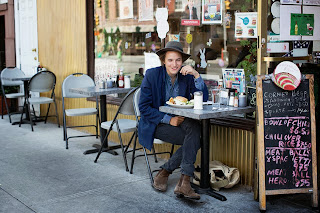
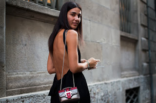
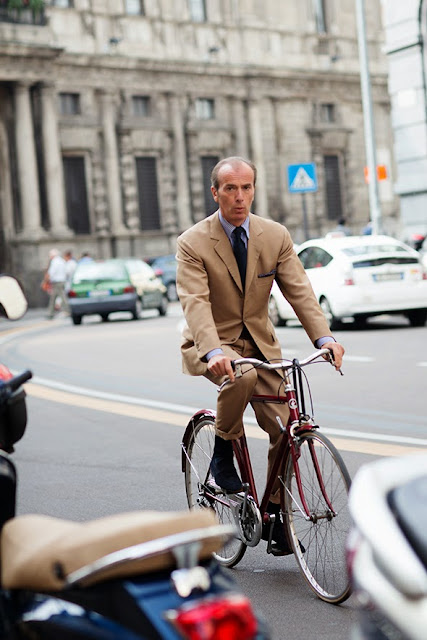
What first researching Scott I was intrigued by his successful fashion photography blog, "The Sartorialist" which you can view here. This blog he started in 2005 has flourished into one of the most popular fashion street blogs, and here are some examples of photos he posts daily.


He also contributed work to Burberry's "Art of the Trench" marketing campaign.
Tim described him as a modern day Bill Cunningham, and from what I've found that seems pretty accurate. I'm looking forward to researching even more about him for the rest of this project.
SCOTT SCHUMAN

What first researching Scott I was intrigued by his successful fashion photography blog, "The Sartorialist" which you can view here. This blog he started in 2005 has flourished into one of the most popular fashion street blogs, and here are some examples of photos he posts daily.


He began this blog "with the idea of creating a two-way dialogue about the world of fashion and its relationship to daily life." Schuman does a great job of not only capturing great fashion but also great emotions and great photographs along with the great fashion. Schuman's has also worked and photographed for GQ (in which he produced his own page each issue for four years), Vogue Italia, Vogue Paris, and Interview. He has also completed commissions for GAP, Nespresso, Absolut, and DKNY Jeans just to name a few. He has also produced photo books based on his work for The Sartorialist, starting in 2009 and has sold over 100,000 copies.
This article I found on him does a great job of showing how he progressed over the years as a photographer through his photos from his blog. It notes that while his eye for fashion has been sharp from the beginning, his quality of photos has really grown since he first started the blog.
Scott Schuman attended Indiana University graduating with a degree in apparel merchandising and a minor in costume construction. Some of his other work throughout his career includes i
n 2008, he appeared as a model in GAP's fall campaign, which can be seen below.

Tim described him as a modern day Bill Cunningham, and from what I've found that seems pretty accurate. I'm looking forward to researching even more about him for the rest of this project.
Subscribe to:
Posts (Atom)