Thursday, September 27, 2012

An Accomplishment & A Challenge

{First thing's first: my accomplishment.}
My poster was one of the chosen ones to be in the display case outside of our design studio! I was really excited and so was my friend Anna who is also in my class because her poster was chosen to be displayed as well.

My Chaco poster design is second from the left on the top row
Anna's, my friend and classmate, designed the ActionFit Earbud poster
second from the right on the bottom row.

It may seem small but it was an exciting accomplishment in my book! It was another affirmation that my change of major was not for nothing; I am meant to be a designer.

{Now, for the next challenge.} 
Our next project has already been underway for about a week now. While our last one was about displaying and designing a poster for a well-designed object, this next project is on the opposite side of the design spectrum. We will work in groups of three and our challenge is to re-design a poorly made object that is equivalent or less than $5. We must produce a poster, final prototype, and iMovie to advertise the new product.

{Step 1}
To start off, we were split into groups of three on the day we were told to bring three poorly designed objects. I brought a disposable razor, a mini light from my keys, and a tape dispenser. Out of all of the objects that my partners and I brought we narrowed it down to two options: the razor and a cheap cutting board. After much deliberation and talking to Tim, we decided upon re-designing the cutting board.


This particular cutting board was only $0.97 before tax at Walmart, and my group and I had many things we thought could be beneficially changed about it. We didn't like the handle and how hard it was to pick up, the rivets on the side didn't seem to be serving much of a purpose, and there weren't even rubber grips on the bottom to keep in place when in use. We did, however, like the size of it (it's not too big) and that it was plastic.

{Step 2}
Next we were told to make 50 sketches of the object including ideas and ways to re-design our project. Here is an example of some of mine:

{Top left corner}: adding lines or measurement to the board for ease in measuring while cooking
{Middle top}: a bendable handle for easier storage
{Top right corner}: a place to set your knife on the board during cooking, where it won't fall on the floor
{Middle far right}: some sort of drainage system through the handle
{Bottom row middle}: Some sort of storage when you open the board

Many ideas, prototypes, and interviews will be taken in order to get the best ideas possible and recreate this board in the best way possible.

{Happy thursday!}

Tuesday, September 25, 2012

The past few days, in an {Insta}

I've had an account on the social media account Instagram for over a year now, and I still love it to this day. I have seen it grow from my five closest friends and I having it to almost every college student I know who has a smart phone, but I am still a big fan of the app. I think it's such a cool way to share little parts of your life with friends who may be across town or across the country, and I wanted to share a few from the past few days of my life.

I repped my feather hair accessories to the plaza in KC on friday night,
when some friends and I decided to make a trip to the Cheesecake Factory
 for some delicious cheesecake, of course.
We were pleasantly surprised to find out there was also an art fair
accompanied by live music happening at the plaza as well!
So after our cheesecake, we embraced and enjoyed the artsy world.
I was loving every second of it.
Every study session is made better with coffee, especially when the cafe has
an outdoor patio. My homework location of choice this last weekend: Dunn Brother's.
Today I visited the art museum on campus, Spencer Museum of Art, to study
a painting I am writing a paper on for my modern art class. I was very impressed by all
of the art, and hope to make it back for fun sometime soon to look around.
{ Want to follow me on Instagram?: allie_ann93 }

Sunday, September 23, 2012

Rock Chalk Designs

While procrastinating on homework, I made this KU poster in Illustrator:


I got the typography inspiration from Pinterest and wanted to try the technique out for myself.

{Musical Musings}
I recently fell in love with a band I found via YouTube.
"My Heart is Yours" artist: The Levi denBok Band
You can check out the song here. I'm not sure if the band is still currently making music, but I found one of their albums on Spotify if you want to check out more of their stuff. Enjoy!


Tuesday, September 18, 2012

Project 1, Out.

I have officially turned in my first project for the first time in the design program here at KU! Which is an exciting feeling. I am even more excited about how much I will learn and grow over the next four years of school. Like my instructor told us today, it can only go up from here and these first year projects will probably be some of our worst. (Which sounds negative, but I'm thinking of it in a positive I can only get better sort of way.)

My final poster hanging up in the class room.
Sorry for the bad photo quality #iPhone3GSprobs
We also turned in our process notebooks today. I really like the way mine turned out and I wanted to share a few screen shots of it:
         

The book was twenty-two pages in length and we were told to staple it together. So overall it was a pretty simple process book, and I really enjoyed getting to use InDesign to make it. When printing the book, the colors turned out much different than I wanted or expected. The green color in the book is the same color as in the poster, but it did not print that way. I just kind of had to go with it, though, because it was still an OK green color and I had already paid to have it printed. I'm a broke design student these days, so I kinda have to go with the flow.

{Fall Fashion}
This past weekend there was a contest via one of my favorite online shopping/blogging sites: ModCloth.
They Instagram'd a photo explaining to take a photo of you in one of your most chic looks and three of their chosen bloggers would choose three winners to win $100 ModCloth gift cards. More information on the contest can be found here. I figured there was no harm in trying so I submitted a photo of my own.

Nautical striped shirt: Forever 21
Tribal necklace: Charming Charlie
Blue lace skirt: Francesca's
Boots: Target
Feather earrings: Boutique in Waco, TX
I don't know if they have chosen a winner yet, but it was really fun putting together an outfit either way. And I made my brother take pictures of me in the backyard - so that was a good time. Believe it or not the picture on the right was sort of an accident... I didn't mean to be "that girl" taking a non-so-chalant photo but it sort of worked out.

{For to set the mind on the flesh is death, but to set the mind on the Spirit is life & peace. Romans 8:6}
This week has been so busy, and I feel like all of my sisters at the Chi as well as all the students on campus have been feeling the same busy feeling. My goal for this week has been to set my mind on the Spirit, like it calls to in Romans 8:6. 

Sunday, September 16, 2012

Concepts of Color & A Finished Product

In addition to finding examples of the color vocabulary, we also had another assignment on color called "The Color Police". For this assignment, we were told to bring an example of good and bad color to discuss in class. Here are my examples:


> Good color: For my example of good color, I found this magazine layout from a free handout magazine. I chose this because I liked the way the designer used colors from the photo on the left page within the design spread on the right. It helps the reader’s eyes see the pages go together. Additionally, I liked how the values of the colors on both page were harmonious, creating a harmonious layout. 


> Bad color: For my example of bad color I chose these two subscription inserts from Teen Vogue magazine. I found that both of them used color in obnoxious ways. For example, on the top one the designer used almost every color in the border creating your eye to jump to the border rather than the information inside and it is very overwhelming. The one on the bottom is more of bad design, but I did not like their use of color in the border again as well as the muliple different blues.


     After experimenting with many different colors, typography techniques, PhotoShop techniques, and moving around everything on the poster so many times I finally have my final product done.


This is my final product and I was even able to print, cut, and mount it on the 18" x 24" foam core last week with the help of my wonderful friend and classmate Anna Sabatini. I am still working on my process notebook, but it is coming along and will be printed on 8.5" x 11" paper in full color when I'm finished.

{Music Musings}
One of my favorite parts of my new major is the fact that I can listen to music while working on my homework (drawings, projects, etc.) Because of that I'd love to share with you some of my favorite songs I've been jammin' to while making this project. I've been in a Ben Rector and Mat Kearny phase during the past month, so those were types of artists that inspired some of my playlists.

1. Count on Me {artist: Mat Kearny}
2. Running Around in my Dreams {artist: Tyrone Wells}
3. Good Life {artist: One Republic}
4. White Dress {artist: Ben Rector}
5. Lasso {artist: Phoenix}
6. Awake My Soul {artist: Mumford & Sons}
7. My Heart is Yours {artist: The Levi denBok Band}
8. Feels Good at First {artist: Train}

While these weren't the only songs I listened to, they definitely made the mix more than once. I classify most of these songs in my "When You Wanna Chill" playlist. Feel free to check them out, and enjoy.

Monday, September 10, 2012

Inspiration & Execution

     Along with talking about color in class we've also had some out of class readings and in class videos that have helped build my view on "what is good design?". One of these was a reading excerpt from blackboard from three different books: By Design by Ralph Caplan, Toothpicks & Logos: Design in Everyday Life by John Heskett and Understanding Design by Kees Dorst. I picked up a lot of key elements about design from these readings and I wanted to share just a few:
> Media and the world had made design into a lightweight thing because it can be put into categories that are understood (i.e. fashion design, interior design, etc.) but these parts of design should not be taken as a whole.
> If a product is designed well or poorly this has the possibility to effect our everyday life, so why are some products made badly? Sometimes cost is a factor.
> Many people have their own definition of what design is and it can be seen in so many ways because it has never cohered into just one unified profession.
> Design can be defined as: "The human capacity to shape and make our environment in ways without precedent in nature, to serve our needs and give meaning to our lives".
> The history of design can be described as a process of layering: more elements are added over time.
> Design as learning: go for your design then look at it with a critical eye. Propose & experiment. Learn.
> Design as a social process: design is an overlap of different designers' ideas as well as different fields of study.
> Design is a game with very few rules.


     In addition to the readings we also watched a Don Norman video in class. It was actually really interested and wasn't too long. If you'd like to watch it too just click here.
He discussed how if a product is excellently designed as well as makes the consumer happy that can be just as much of a successful design as if it's a usable product. For example: he purchased a gold juice maker that he never really uses to make orange juice because the acidity of the orange would actually ruin the gold on the juice maker. He however has it out for display because it's design is amazing:

 
He continues to talk about other fun products such as mini coopers which are good design because they are fun to drive and the design is fun. He states: "pleasant things work better".
He also discusses three different types of design: visceral, behavioral, and reflective.
1) Visceral: We have co adapted through biology to like bright colors, dislike loud sounds, dislike extremely hot or cold things, like symmetrical faces, etc. You can appeal to people as a designer through this with typography (red type to mean hot and blue type for calming or cool). Another example of this is you buy a pretty bottle of water or wine sometimes just to keep the bottle for decoration and not always for the liquid inside.
2) Behavioral: Automatic skill and behavior all about feeling in control with a product. For example, Don Norman had purchased a global knife that was so well made and worked so well he felt really in control while using it to cut things. Also, drivers of sports cars are a part of behavioral design because they feel in control while driving the car.
3) Reflective: The little voice in your head that says something is good or bad. An example of this is a Hummer. Owners like it because it attracts attention and you buy it because it's expensive and it attracts people.


     Continuing with the design inspiration and information, I wanted to share some typography rules that our TA Daniel shared in class last week. I thought it was clever how they were put together.

The 10 Type Commandments
1 – Thou shalt use limited typfaces
2 – Thou shalt not use gradients in your typefaces
3 – Thou shalt not use papyrus
4 – Thou shalt kern properly
5 – Thou shalt remember not to use strokes over type
6 – Thou shalt not hypenate a headline
7 – Thou shalt make type easily legible on a color field
8 – Thou shalts not put type on a path
9 – Thou shalt not use dropshadows
10 – Thou shalt leave a widow

And last but not least I wanted to share some progress on my project. I'll forewarn you, however, that I'm going to be sharing a lot of the beginning stages of my project as in some rough, ROUGH, drafts. But, enjoy!

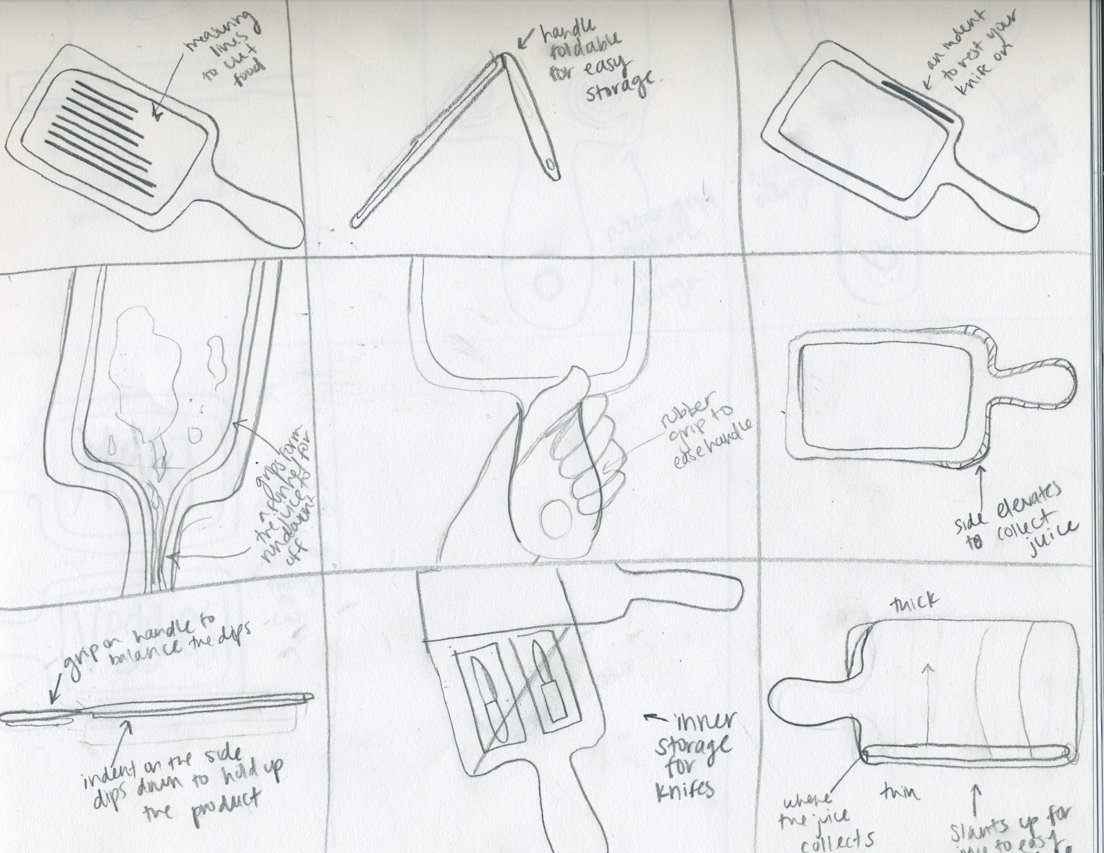
Pictured above are my thumbnail sketches for my poster. Thumbnail sketches are
basically rough sketch ideas of what the design of my poster could look like.
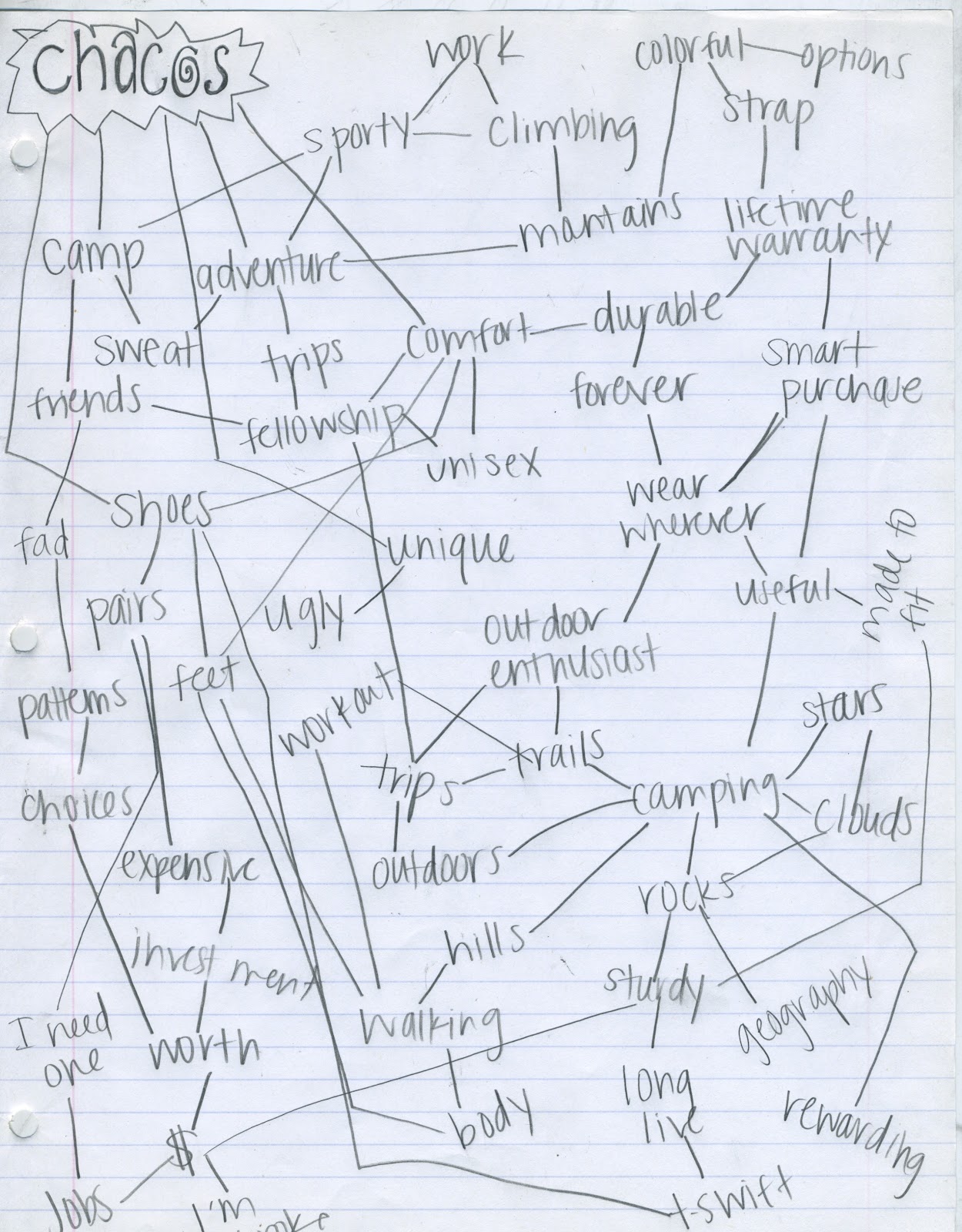
A brainstorming list of words that came to mind when I thought of Chacos.
One of my original (and very rough) poster ideas brought to life on 18 in x 24 in newsprint.
I like how I got the idea of motion of the shoes across but the line on this poster wasn't
 executed well and the idea wasn't very visually captivating. In fact, it was pretty boring.
Here is my second rough draft 18 in x 24 in newsprint made up. In my head, I wanted
the outline of the chaco straps to be blown up more and expanded across the bottom and
I couldn't get that expressed with my size of printer. I did like, however, the idea of the
chaco strap becoming a "mountain" and the Chaco consumer climbing across the mountain
of Chaco in their shoes. Also, this one includes color. I used ideas from this poster in my
 soon-to-be-final design.

Sunday, September 9, 2012

Some work of my own

After downloading a free trial of Illustator last year, I was overly excited to create things. I would spend time in between classes making some of my favorite Bible verses come alive via typography (probably one of the big signs I knew I should switch my major from Journalism to Graphics). Here is an example of one of my creations:
Also, the other day I created a poster for a Bible study my friend and I are leading on our campus.


Actually owning Illustrator, InDesign, and Photoshop makes me so happy! I was meant to be a designer.


Monday, September 3, 2012

Our first project

     These past couple weeks in BDS 101 we've already been working on our first project while also studying good design in order to help us understand what is "good design".

Our first project (in my own words): Through the study of good design make a poster featuring a product that exemplifies good design. Feature the product on your poster, rather than typography, and make sure the poster is visually pleasing.

The details: The final poster will be mounted on 1/4" thick foam core board that is 18x24 inches in size. Along the way, use 18x24 newsprint to lay out rough drafts and sketches. The final poster will be created using Adobe InDesign, along with the project's process notebook.

What's a process notebook?: Along with our poster, we will be creating a process notebook to show ups and downs, inspiration, rough drafts, and etc. of our poster along the way. While making my poster I've been saving notes and thumbnail sketches along with taking screen shots of my computer design work to put in my notebook. This way the viewer can look through the book to see the whole process of how I designed my poster. This will also be created in InDesign, which I'm really excited about because I love using the program and already have lots of experience using it.

In order to teach us about good design, we have been watching some videos and reading some articles in and out of class to gain knowledge and inspiration. One of the articles titled "Dieter Rams: Ten Principles for Good Design" can be read here. In case you don't want to read the whole article, however, let me sum it up for you in my notes:
Rams set out 10 principles of good design in the 1970s when noticing that the world around him was an overwhelming amount of colors/sounds/design.
Good design:
1) is innovative: innovative design is always developing
2) makes a product useful
3) is aesthetic: only well executed objects can be beautiful
4) makes a product understandable: it's self-explanatory
5) is unobtrusive: products fulfilling a purpose should be neutral and restrained
6) is honest: does not manipulate consumer
7) is long lasting: unlike fashionable design, it lasts
8) is thorough down to the last detail
9) is environmentally friendly
10) is as little design as possible: concentrate on essential aspects.

I really enjoyed reading this article and looking at design of products rather than just thinking about design in graphics, layouts, clothes, and etc. like I normally do. One thing I disagreed with, however, is #7 that claimed fashionable design isn't long lasting. While I think lots of fashion is trendy and goes out of style quickly, I also think many fashion looks can stand the test of time (with a little twist, sometimes). Not only that, but looks can come back in style proving it to be long lasting in it's own way. Want an example? Chanel's "Little Black Dress"

More information about the LBD can be found here,
which is also where this picture was found.


     While this "Little black dress" started out as an idea from Chanel it ran way past fad and turned iconic. Every woman, and man for that case, knows that a little black dress is always fashionably acceptable, won't be going out of style anytime soon.

     Back to the project, I chose Chacos as my well design object to display on my poster. Why you might ask? Well, even though Chacos are not fashionable whatsoever (in my personal opinion) they are quite useful and fulfill their purpose through their design. While they are expensive (about $100 per pair) their strap has a lifetime warranty. They are really popular at camp (specifically Kanakuk Kamps, where I worked this summer) and rightfully so because you can wear them in and out of the lake as well as on hikes, through the mud, and basically wherever if you're planning on being outdoor-sy. The good design allows you to wear them all these places without worry of getting them dirty because they can be cleaned off easily. The strap keeps them on in any circumstance and the sole is extremely comfortable. Their one flaw, in my opinion, is that they are kind of ugly. But while that's just my opinion, I still find them useful and a good investment. Some pictures displaying my chosen product can be seen below:


I'll keep you updated on how my poster is coming along as well as showing you rough draft examples along the way. The final project is due Tuesday, September 18th.

My friend found this picture of Chacos formed into the greek letters
Chi Omega (the sorority I'm in) and I loved it so much I had to share.