Tuesday, June 11, 2013

Project Psalm 139.

So I've been a lot busier than expected this summer. But I challenged myself at the beginning of the summer to work on a project of my own. I decided to work on "Project Psalm 139." Basically I'm going to hand letter all of the verses of Psalm 139. I've wanted to work on my hand lettering and I've been working on memorizing this Psalm, so it's a perfect project for me this summer. I just made verse one, and here is what I have.


Basically I'm hoping to work with improving my hand lettering on this project. I want to work with the lettering on the computer as well and see what I can do with changing the colors, overlaying the lettering on pictures, etc. I think this will be a really cool way to see my hand lettering improve over a period of time, too.

Hope you like it. :)

Monday, May 20, 2013

School's out for Summer

It's FINALLY summertime! And with the craziness of finals week, I haven't had a chance yet to post some pictures of one of my favorite final projects. The hand bound book from my BDS studio, which I turned in last thursday. I quickly took some pictures right after I was done binding it, and meant to take more later but forgot to before I turned it in. So below are some quick ones I took on my phone, showing all of my design work from the book.


I was so proud of my book! But I'm also so ready for summer. A little break from school but still with some crafting, creativity, fashion, etc... so stay tuned. :)


Thursday, May 2, 2013

// Book Design and Inspiring Times


The book design is still underway and I have been working on re-designs of my Bradbury Thompson spreads as well as the table of contents, title page, book cover, etc. We were officially paired into groups for our book and I got paired with four other graphic design majors, so the rest of the content in my book will be about their chosen graphic designer. We decided upon "A Grab Book of Graphics: Designers of the 20th Century" for our book title. It's a play off of the phrase "A Grab Bag". We also were told to make a name for our publishing company, as we will be hand binding these books ourselves. Someone in our group came up with "Perfect Puppy Publishing". We will each make our own logo for the publishing company.

I had a lot of fun working on the logo for our publishing company.
This is what I came up with.

This photo shows my re-design of my Bradbury Thompson spreads, which turned out
much more successful the second time. In this version the blue on the bottom page
is still really dark, however,  and some of the fonts were hard to read.

This picture shows my rough drafts of the table of contents, title pages, and again my Bradbury Thompson spreads. The top three layouts are the title pages and the middle three show the table of contents. I was really happy with these rough drafts, and I loved a lot of aspects on many of them. My group really liked what I was doing with the far right pair and so I decided to take some of their critiques and move forward with that basic idea.

///////////////////////////////////////////////////////////////////////////////////////////////////////////////////

All of this book re-designing caused me to want to take a trip to The Dusty Bookshelf downtown to get some inspiration of my own. After overworking some ideas with the title pages and table of contents I needed some new fresh ideas. The cool thing about this buy/re-sale book store is they had a great mix of new innovative books and older classics. It was a great space to find a little inspiration.

One of the first things I noticed in this huge store was that if the book didn't
have an interesting or eye-catching spine design it was easy to miss.
I dually noted this for my own book design.
I loved the tabs and right and left alignment used in the table of contents of the book "P.S. I Made This"


Simple, but it caught my eye from afar. Which I loved.

I liked the use of a black and white picture with a touch of color in the title graphic.

The overlay of orange reminded me of some of Thompson's designs.


There's something just beautiful about a really old book.
The gold letterpress was so pretty.

The overlap of opaque text, pictures, and blues reminded me of Thompson's work.
I liked how they used these principles.

Ironic that this book is titled "Even More Great Designs" because
I hate the design of this cover. It's terrible.

The simple gold letter press, again, caught my eye from afar. Love it.

This book caught my eye from the get go and I just had to get a picture before I left. Not only did the mix of drawing/pictures intrigue me but I loved the fact that this modern book was stacked on old books. It might have been unintentional, but it was an interesting contrast.


Wednesday, April 24, 2013

Bradbury Thompson.

The designer I chose for my layout & book binding project is Bradbury Thompson (1911-1995). He was a graphic designer who brought many new innovative ideas to design in the twentieth century such as magazine layouts, a redesign of the Bible, and even a new alphabet that he called "Alphabet 26". But the best part? He's from Topeka, KS! My home state. I knew I'd love him as soon as I found this out, and especially when I found out he is known as the father of modern magazine design, as I have an interest in the field.

Next goal was to create three different two page layout spreads for our book about our designer, that included the 400 word essay we wrote on our designer.


Those are my three layouts pinned up for critique in class. I liked some elements of them and the first layout idea was my strongest design - but a lot of editing also needed to be done. I've already changed quite a bit about the first one trying to implement more of his work into the spreads. More progress to come on those.

////////////////////////////////////////////////////////////////////////////////////////////////////////////////////////////////////////////////////////////////////

Another project I'm excited to share is my screen printing from ART 133. While I had a love/hate relationship with the project, I'm pretty happy with how it turned out. I had many mistakes but during the process I realized that was bound to happen as it was 2 whole yards of fabric and it was my first print ever. We used a leapfrog technique to print it and the dye mixed methods that we had already learned about in class. Check out some pictures of my hand designed and printed fabric below.


Monday, April 22, 2013

A project. Or two or three.

Life is flyin' by and I actually finished my chair a couple weeks ago, but am just now having a chance to post pictures. Check out how the final chair turned out below.


The meaning behind it: As stated in a previous blog post, my first goal was to create a strong base structure. That is where the grid idea came from. After making some larger models than you saw in the previous post, I decided to link the grid with two horizontal pieces at the top and bottom across the length of the seat. The other idea I wanted to stick with throughout was the symbolism of my sister's chair being a "mini-me" version of my chair. So that's exactly how I made them: identical but one big and one small. The back of the chairs form a circle when placed right next to each other, but in the sense that if the smaller chair grows to be the same size as the bigger chair it would form a perfect circle. Finally, I was trying to decide if I wanted to hook the chairs together but when thinking about the chairs based on the relationship I realized they should be able to be back to back, side by side, far away, etc. because my sister and I's relationship is ever changing too. Sometime she's in Wichita and I'm in Lawrence and sometimes we visit eachother. Sometimes she's mad at me cause I won't let her jump on my bed and sometimes I'm mad at her for throwing my shoes everywhere. Our relationship right now is just ever changing, and I wanted the chairs to reflect that.

// Art 133:
I am also enrolled in another studio this semester, Art 133, and which is the intro to textiles. A couple weeks ago we finished one of our biggest projects of the semester which was making a quilt. We had to make our quilts out of the fabrics that we had hand dyed in the class previously in the semester using various dyeing techniques. I was so happy to get back into sewing and it was really helpful having previous experience quilting.


The quilt, which is approx. 44" x 44" in size, was made all out of hand dyed fabric. Some of the block designs were assigned to us and some we were allowed free to choose a quilt block from the internet, or even make our own design as on the applique block. I ended up really enjoying paper piecing, which a couple of the blocks were made from.

Last but not least...
Our next project for BDS 102 is very graphics related and I couldn't be more excited. The project is to choose a designer in your field and make a two page book spread including an essay about your chosen designer. Then, our teacher will assign groups of approx. 5 people per group and we will use all of our layouts to each individually make a book. We will be hand making these books and each have our own to turn in for our final project. My designer is Bradbury Thompson. Our first assignment was to make a presentation for class about our designer. Check out my Prezi about Bradbury Thompson below. 


Monday, April 1, 2013

That Cardboard Life.

Before spring break we started on our latest design challenge: making a cardboard chair. Not just for decoration, though... this cardboard chair has to hold the weight of a person. More specifically, my chair has to hold my weight. 

Challenge #1: make a chair out of 4' x 4' of cardboard that is JUST folded and not cut. No adhesives (tape, glue, etc.) may be used in the building process. It was suppose to hold our weight. I found this challenge to be SO FRUSTRATING. Mostly because I attempting making mine at midnight the night before when I was very sleep deprived, so I all I wanted was to figure out some way to make this work. Mine ended up just being a box that held your weight sort of... if you sat on the edge of it.


A lot of my fellow students had solutions like mine that ended up looking like a box. I attempted a back of the chair, thats what the floppy cardboard sticking out of the top of the back is suppose to be. At least there was a hint of design on the seat, which was made with tabs to hold the card board together.

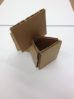
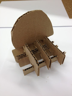
Challenge #2: Make a cardboard chair to hold your weight based on a relationship. This chair is allowed to be cut, not just folded, but still no glue or tape can be used to hold it together. Our next steps were to write an essay on the relationship we were basing our chair off of and then make three mini models out of thick paper or cardboard demonstrating our three best ideas.

The relationship I decided to base by chair off of was my relationship with my little sister. Lauren Kay Welch, who is six years old. She's the cutest thing ever, and getting a little sister when I was fourteen years old was the biggest and best surprise of my life to date.
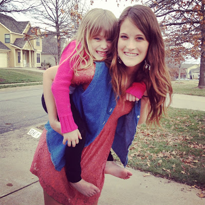
Lauren & I. She is in kindergarten and some of her favorite things are
singing, dancing, spongebob squarepants, and birthday cake pops from Starbucks.
I knew from the beginning that I wanted to make my chair a two-part chair kind of thing. I wanted to make a chair on its own, that also had a mini version of itself next to it. I wanted them to look good together or apart, since my sister and I don't live in the same town. I decided to make her side of the chair the same thing as mine but miniature because all of my friends say she is a mini-me. Since I did not have a lot of ideas on the design, and I had such a problem with structure holding me on the first design problem (chair from above) I decided to focus my three mini models on the structure.
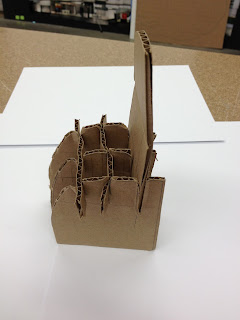

Chair idea #1: a grid structure on the bottom for support. The back of the chair would be a half of a circle, that would be a complete circle when the two parts are together (the mini chair would be a smaller circle though but the illusion that when it grew bigger it would fit with the bigger circle would be there).


Chair idea #2: a triangle formed base for structure. The chair backs would allow my sister and I to sit back to back, but her chair back appears the same as mine just smaller.
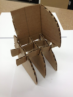
Chair idea #3: again, playing with a grid like structure because I thought this would be the most successful in holding weight.


In class, the idea of the chair back continuing to the side was formed in order to create a stronger back.
I'm going to be a cardboard queen by the end of this project. Also, I'm probably going to never want to see another piece of cardboard again.

Saturday, March 30, 2013

Spring Break Style

Spring break was just last week and I headed west with my friend Kaitlyn to the great state of California. While our trip started out colder than expected, that beautiful Cali weather finally showed up about three days in and I was able to break out some of my favorite spring and summer attire. Check out some of my favorite current trends below.

// High waisted & distressed shorts.
You can see the ones I'm  wearing in the picture
below too, but I loved wearing all of my DIY shorts in Cali.
(I made those shorts from $4 shorts from Goodwill!
Distressing shorts is so easy, I'll probably make a million pairs for the summer.
I even added my own studs on the front pockets.)


// Rounded sunglass frames.
I ordered these from FreePeople.com for spring break.

// Hair wraps.
Kaitlyn and I both have these hair wraps from Free People.
I was so excited to rock mine over spring break!
// white Converse.
One of my recent trend obsessions is white low top Converse.
They seem to be more popular these days in Kansas and Kaitlyn
let me borrow her pair in Cali. I have got to order some of my own soon.

// crocheted shorts.
I bought the cream crochet shorts seen here while shopping in Cali.
They go with so many things - I'm so glad the weather is finally warming
up here in Kansas so I can wear my new shorts ASAP. (Also pictured here,
the sunglasses and hair wrap from above).

California is my new favorite place to be and I can't wait until I go back!

// Musical Musings.
While in Cali, Kaitlyn and I went to the Imagine Dragons concert. They were absolutely amazing live, so you should check out their tour schedule and see if they're coming to a city near you! If you've never heard their music I'd recommend the songs Demons, Tip Toe, and On Top of the World. Those are three of my favorites. 

// Imagine Dragons.